#品牌設計 #Brand Design
佳格健康GO LOGO 設計
Healthy to GO LOGO Design
✨ 專案背景 Project Background
佳格集團的官方電商平台「佳格健康 GO」希望能重新塑造品牌形象,配合整年度的行銷策略,將官方電商的品牌知名度擴散出去,並獲取更多新客。
Standard Foods' official EC platform, "Health to GO," aims to rebrand. By aligning with the annual marketing strategy, the goal is to expand the brand awareness of the official e-commerce platform and attract more new customers.
✨ 設計目標 Design Goals
加入團隊時已經有滿多計畫準備執行,在有限且緊迫的時程下,設計目標為:
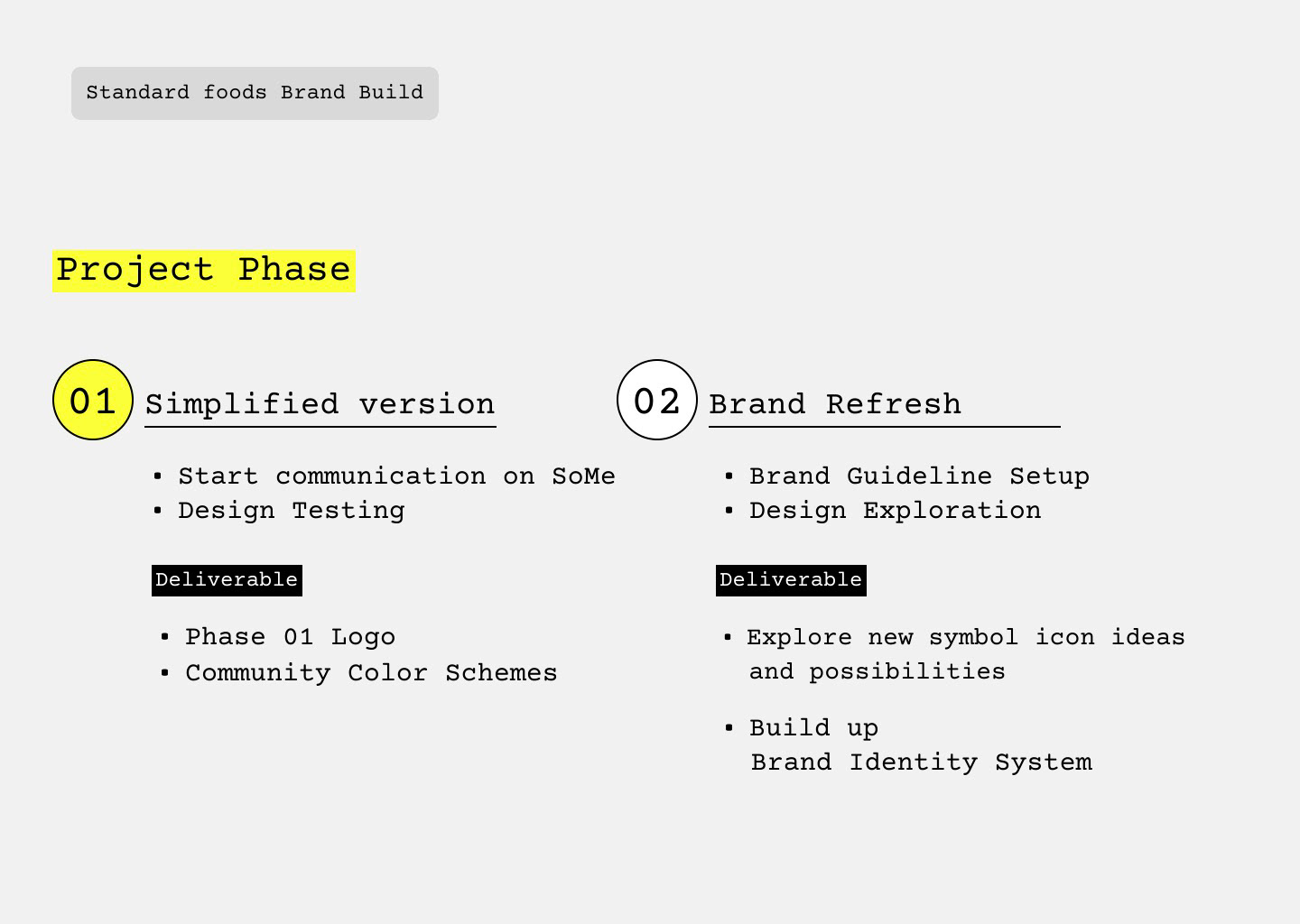
1. 先使用既有字體進行簡易編排,快速更新標誌,讓社群宣傳能順利進行
2. 定調第一版的社群配色,讓代理商能操作更多社群素材,內外設計執行也能有一致的色彩風格
1. 先使用既有字體進行簡易編排,快速更新標誌,讓社群宣傳能順利進行
2. 定調第一版的社群配色,讓代理商能操作更多社群素材,內外設計執行也能有一致的色彩風格
When I joined the team, there were already many plans in motion. Given the limited and tight schedule, the design goals were:
1. Quickly update the logo by using existing fonts for a simple layout, ensuring smooth progress of social media promotions.
2. Establish the initial color scheme for social media, enabling the agency to create more social media content and ensuring consistent color style for both internal and external design executions.
✨ 顏色使用 Color Pallete
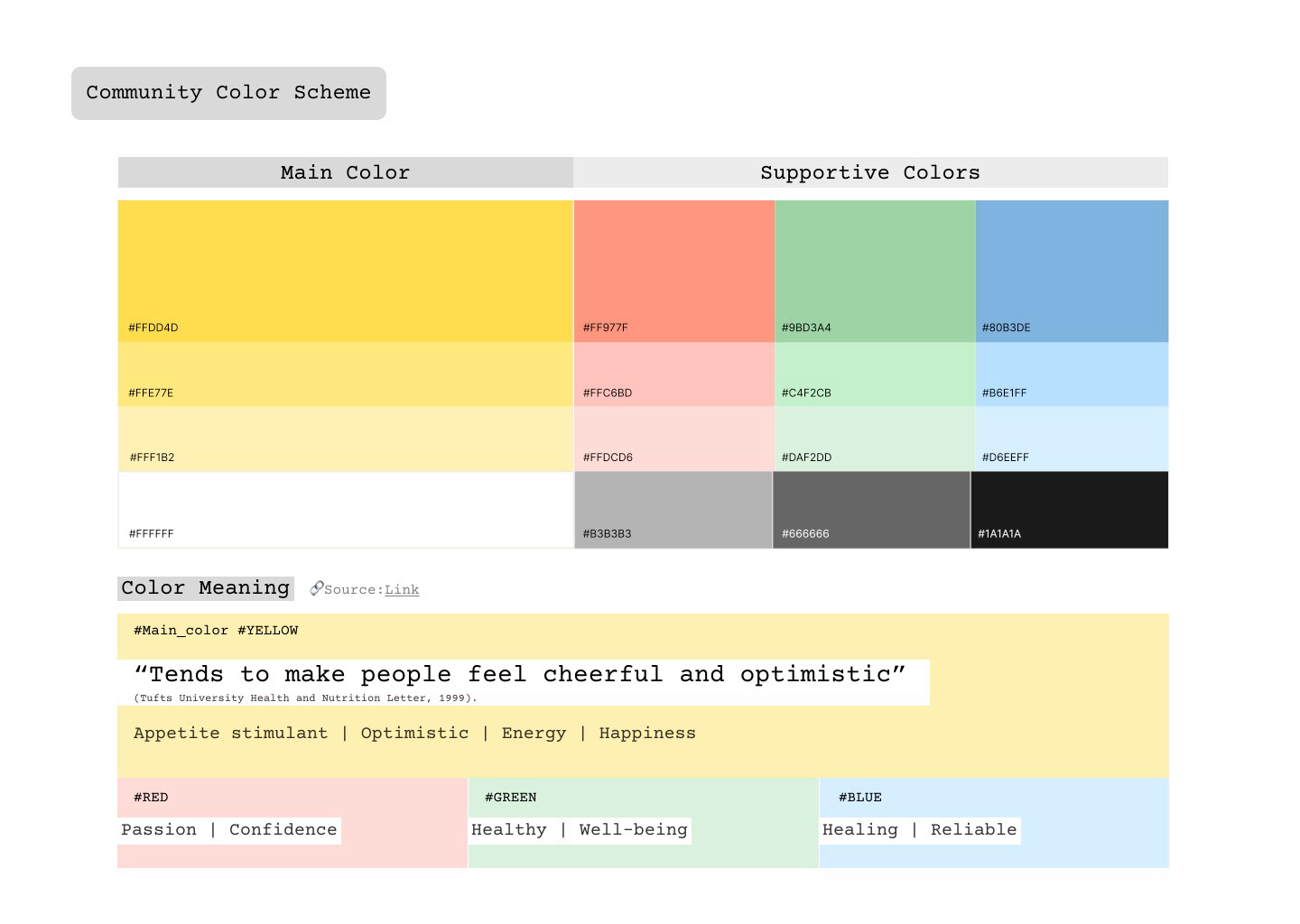
在顏色使用上,主要延伸佳格集團 Logo 既有的品牌色 ( 黃、紅、綠 ),使用黃色作為主色,紅、綠作為輔助色,綜合考量子品牌與品牌理念後,多新增了藍色做使用。 ( 色彩語言可參考圖上說明 )
In terms of color usage, I primarily extended the brand colors of the Corp. logo (yellow, red, green), using yellow as the primary color and red and green as supporting colors. After considering the sub-brands and brand philosophy, I added blue to the palette as well. (Refer to the color language explanation in the image above).
In terms of color usage, I primarily extended the brand colors of the Corp. logo (yellow, red, green), using yellow as the primary color and red and green as supporting colors. After considering the sub-brands and brand philosophy, I added blue to the palette as well. (Refer to the color language explanation in the image above).
