#視覺設計 #UI 設計 #Visual Design #UI Design
Dcard 職人生存挑戰 - 工程師/行銷人頂尖對決
Dcard Artisan Survival Challenge
✨ 專案背景 Project Background
目標 Goals:
1. 透過測驗遊戲讓出社會一段時間(25 歲以上)的年輕人,了解 Dcard 社群中有職場相關的討論
2. 強化 Dcard 社群中有出社會用戶的認知
1. 透過測驗遊戲讓出社會一段時間(25 歲以上)的年輕人,了解 Dcard 社群中有職場相關的討論
2. 強化 Dcard 社群中有出社會用戶的認知
1. Engage young individuals (aged 25 and above) who have spent some time in the workforce in understanding workplace-related discussions within the Dcard community through interactive games and tests.
2. Enhance the recognition and visibility of Dcard community members who are actively employed.
客群 TA:
1. 25 歲以上且已進入職場之重度社群使用者
2. Dcard 既有用戶,但使用頻率驟降
3. 非 Dcard 用戶,激活使用動機
1. 25 歲以上且已進入職場之重度社群使用者
2. Dcard 既有用戶,但使用頻率驟降
3. 非 Dcard 用戶,激活使用動機
1. Young professionals aged 25 and above who are active users in the community.
2. Existing Dcard users with a significant decrease in usage frequency.
3. Non-Dcard users, stimulating motivation for usage.
2. Existing Dcard users with a significant decrease in usage frequency.
3. Non-Dcard users, stimulating motivation for usage.
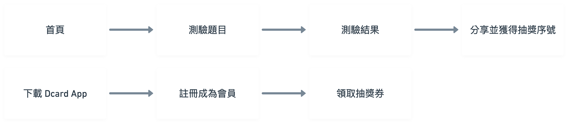
✨ 活動方式 Event Method
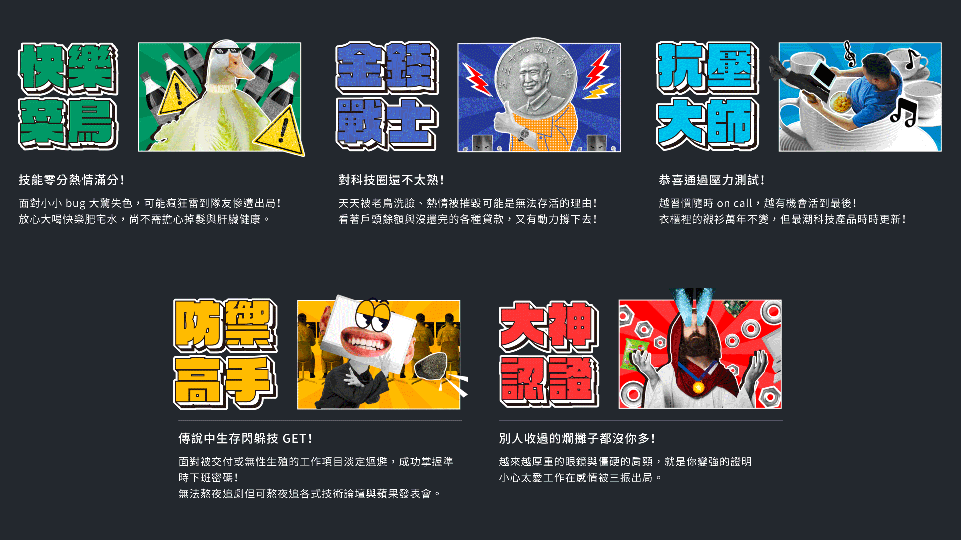
1. 透過10題職人主題測驗,測出自己目前的職人等級
2. 轉發測驗結果即可抽獎
1. 透過10題職人主題測驗,測出自己目前的職人等級
2. 轉發測驗結果即可抽獎
1. Determine your current professional level through a 10-question artisan-themed quiz.
2. Share your quiz results for a chance to win prizes.
2. Share your quiz results for a chance to win prizes.
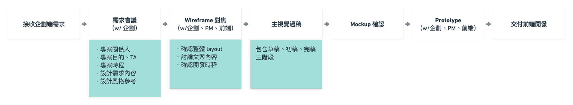
✨ 專案協作流程 Collaboration Process
主要負責活動頁 UI layout 、 視覺設計
Main responsibilities include UI layout and visual design for the event page.
Main responsibilities include UI layout and visual design for the event page.
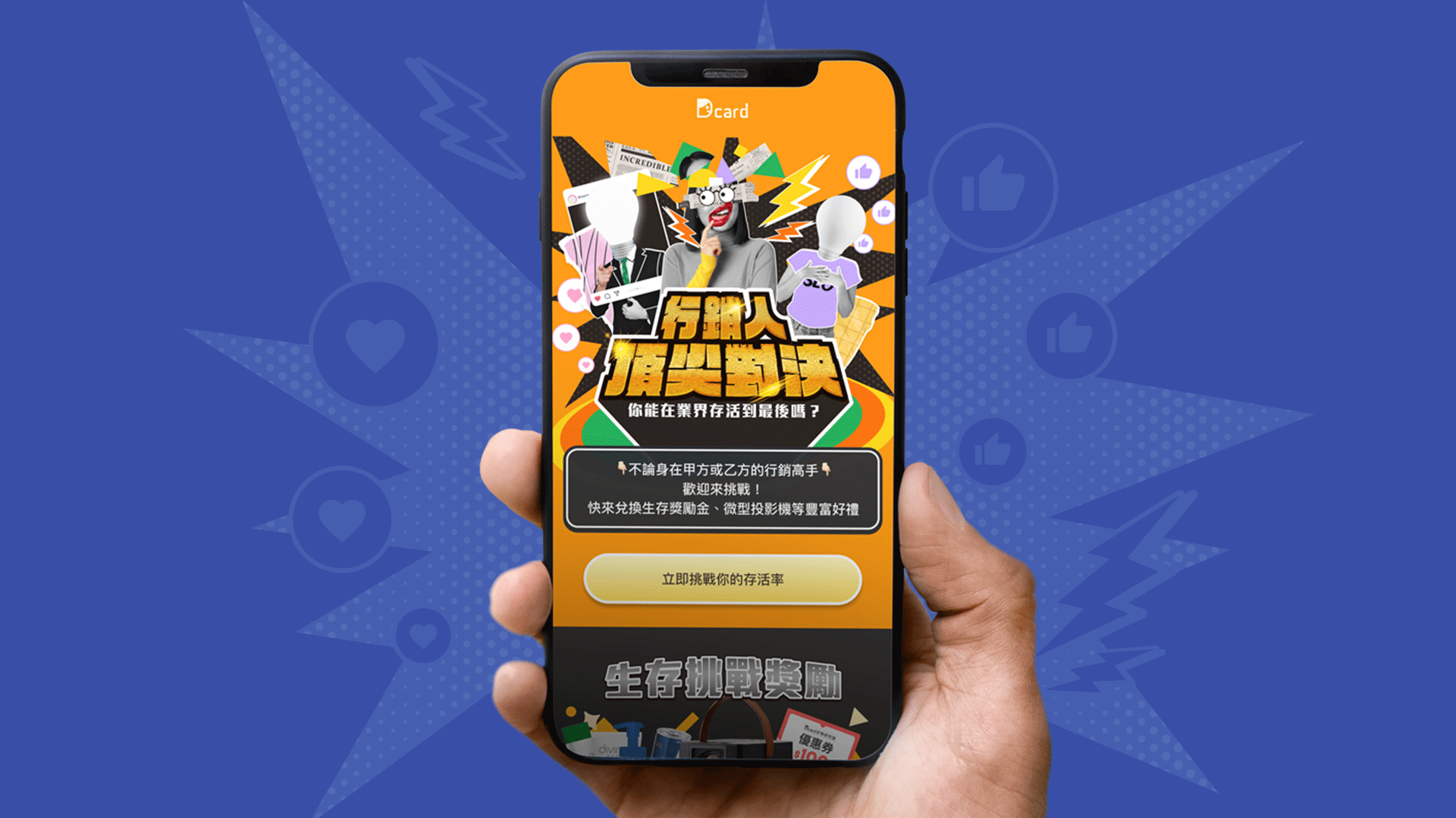
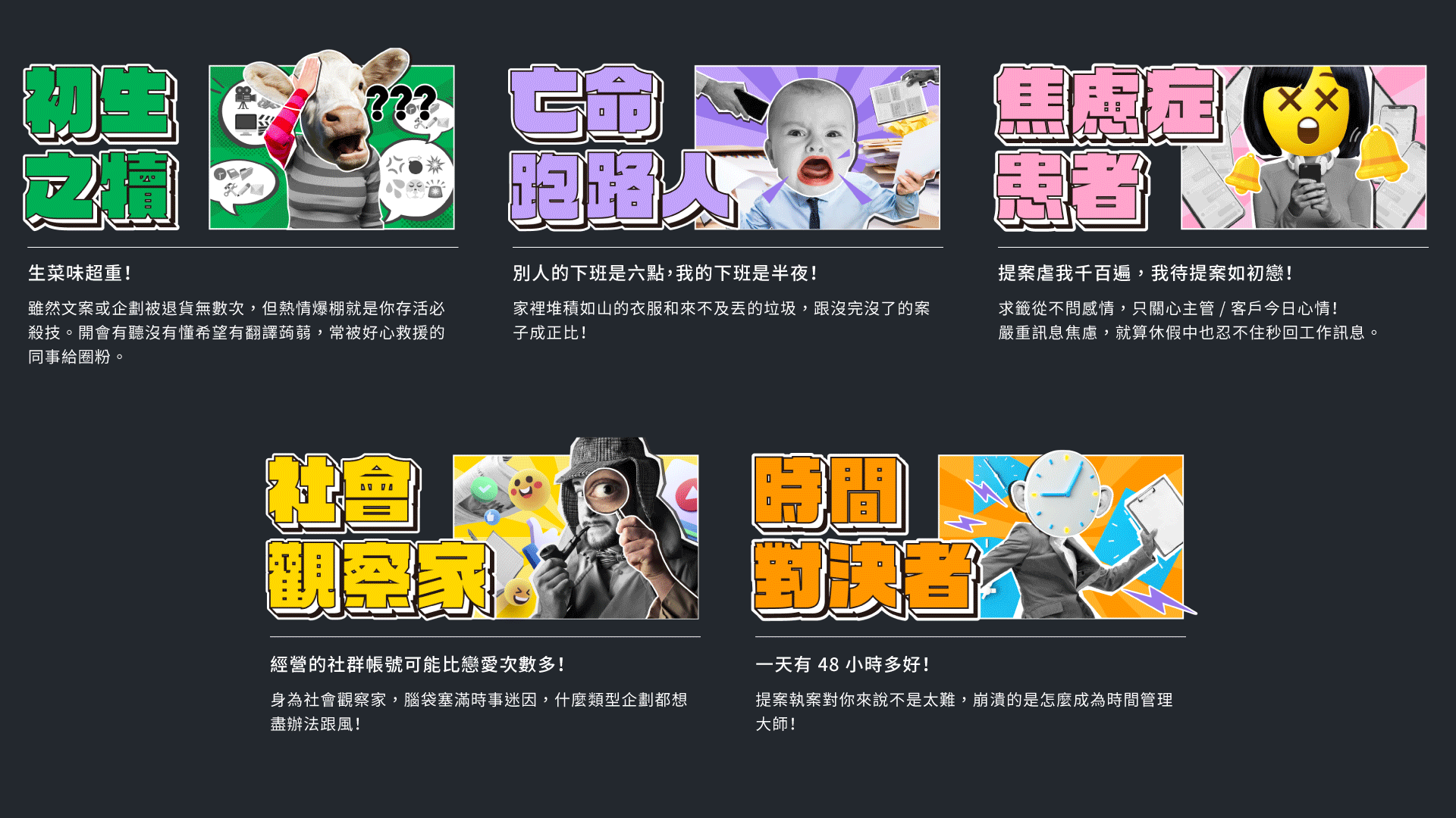
#01 工程師頂尖對決
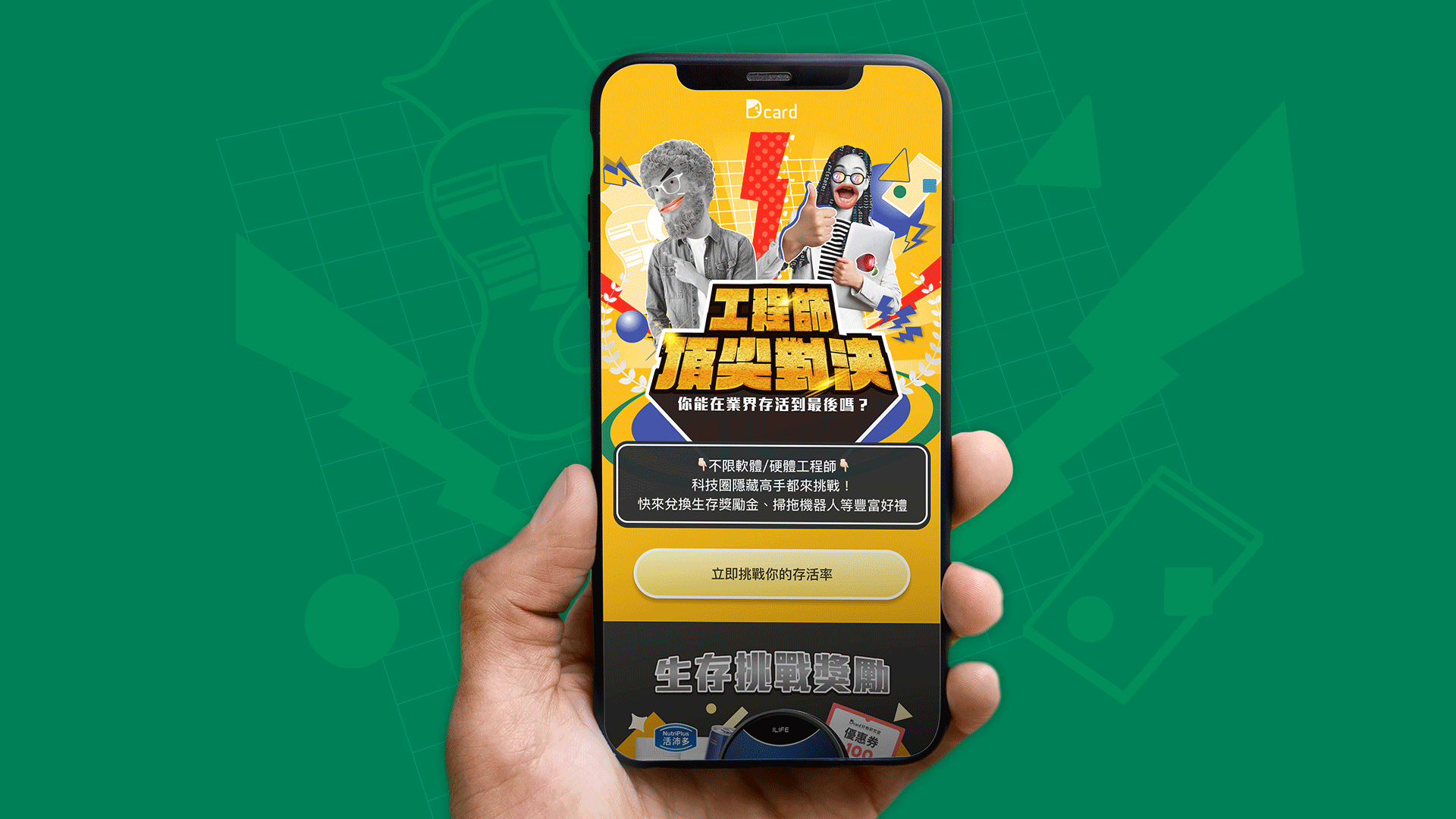
✨ 設計風格 Design Style
Dcard 過往大部分的視覺會使用向量的插畫風格進行設計執行。
這次活動的調性,希望能夠更接近測驗類型的綜藝節目( Ex. 太陽傳說)去吸引已經出社會工作的成年人,所以使用真實的圖片風格取代向量插畫,並結合網路社群元素讓整體視覺荒誕有趣,也將抽象的測驗結果,透過天馬行空的拼貼組合,讓使用者更好想像情境。
For this event, we intend to adopt a tone that closely resembles quiz-style variety shows to attract working adults.
To achieve this, we will replace vector illustrations with real-life imagery and incorporate elements from online communities to create a visually whimsical and entertaining experience. Furthermore, we will present abstract quiz results through imaginative collage combinations to enhance users' ability to visualize different scenarios.
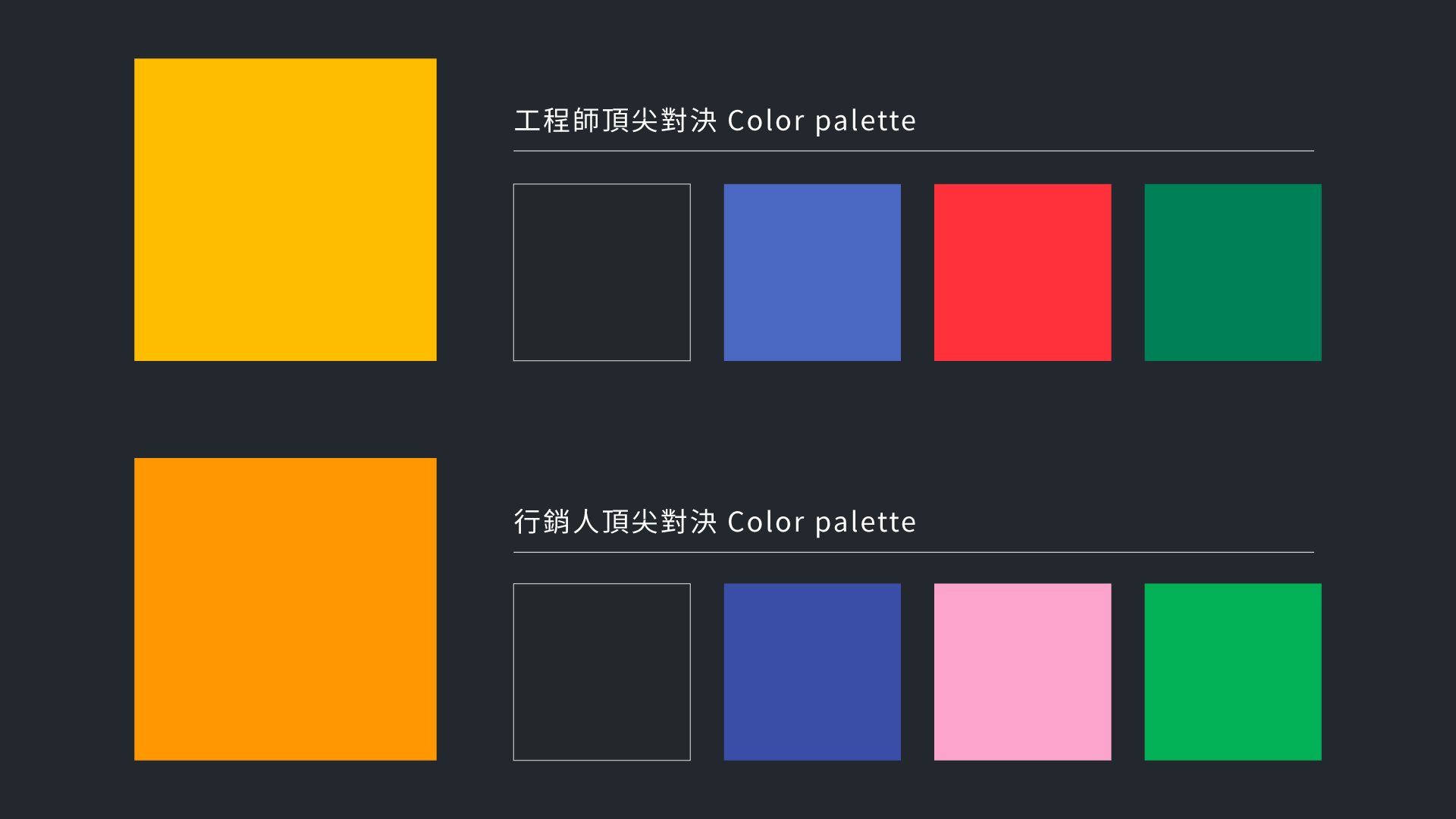
✨ 顏色配置 Color
工程師、行銷人的職人測驗個別選用黃色、橘色作為主色,讓整體活動視覺明亮、充滿活力,相近色系也讓活動有系列感。資訊部分輔以屬於無色彩的深黑灰來做出不同區塊間的對比,也能平衡亮眼的黃色系,減緩視覺疲勞。
For the Engineer and Marketer Professional Assessments, we will use yellow and orange as the primary colors to create a bright and vibrant visual for the overall event. Using similar color schemes will also provide a sense of continuity and cohesion throughout the activities. The information sections will be complemented by a deep black-gray color, which lacks color, to create contrast between different sections and balance the eye-catching yellow tones, thus reducing visual fatigue.
#02 行銷人頂尖對決