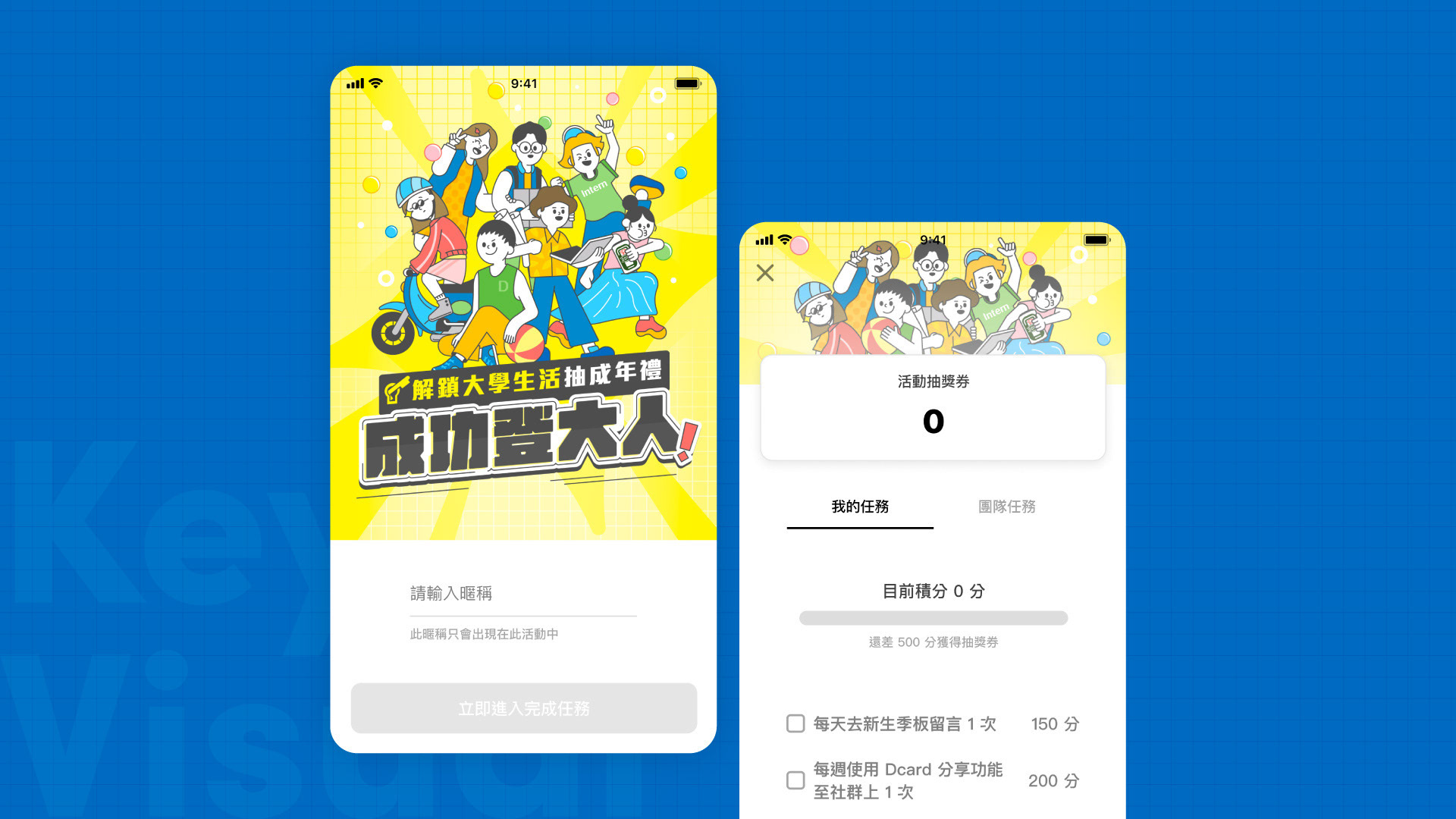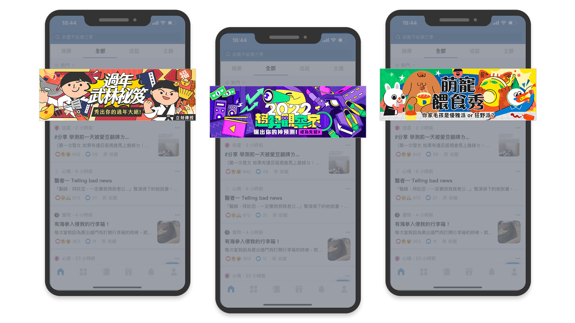
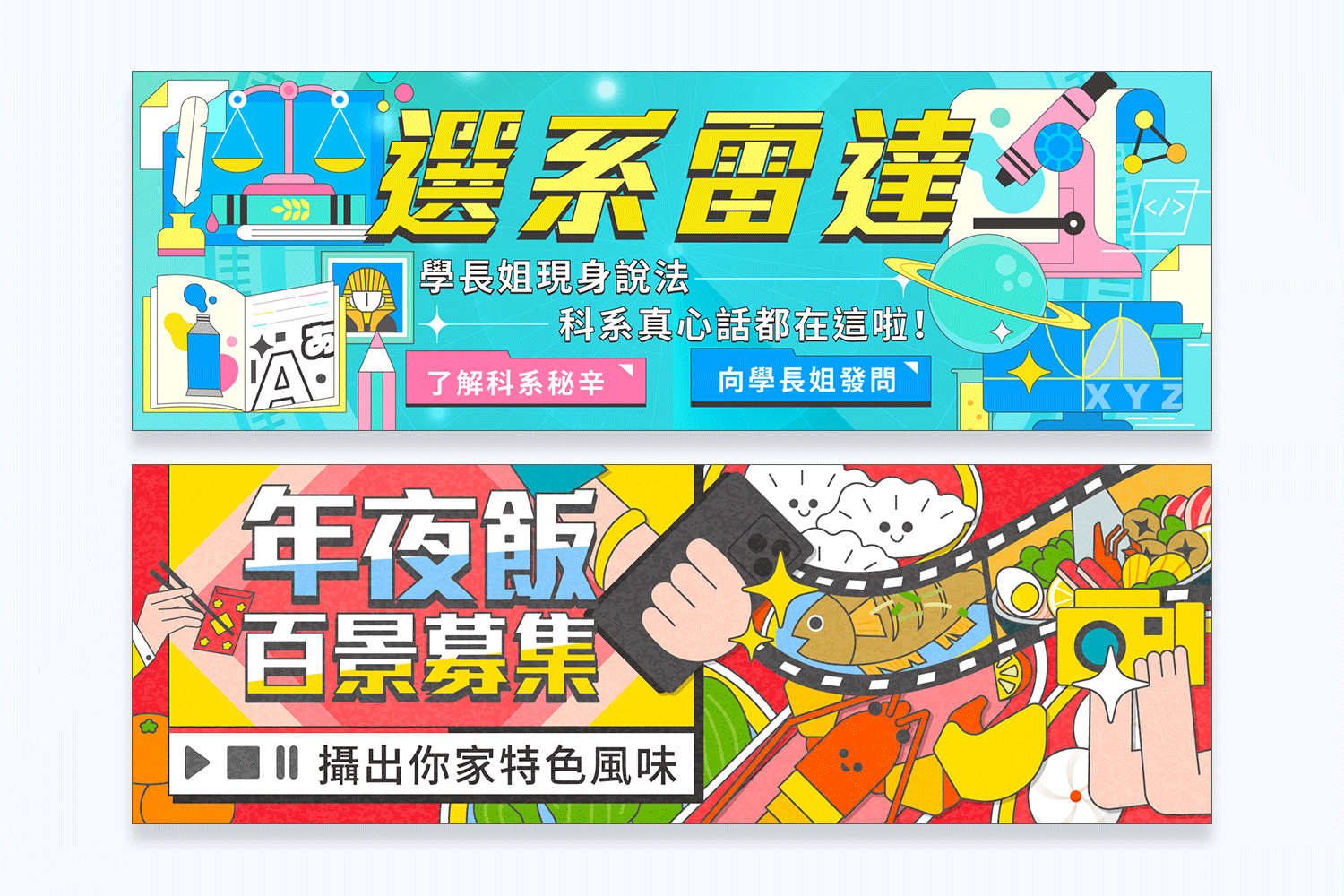
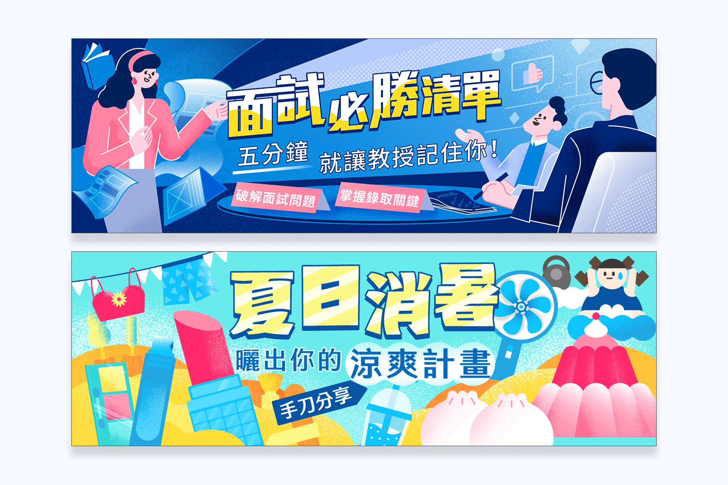
✨ Dcard 台灣總部 - 營運活動 素材設計系列 ✨
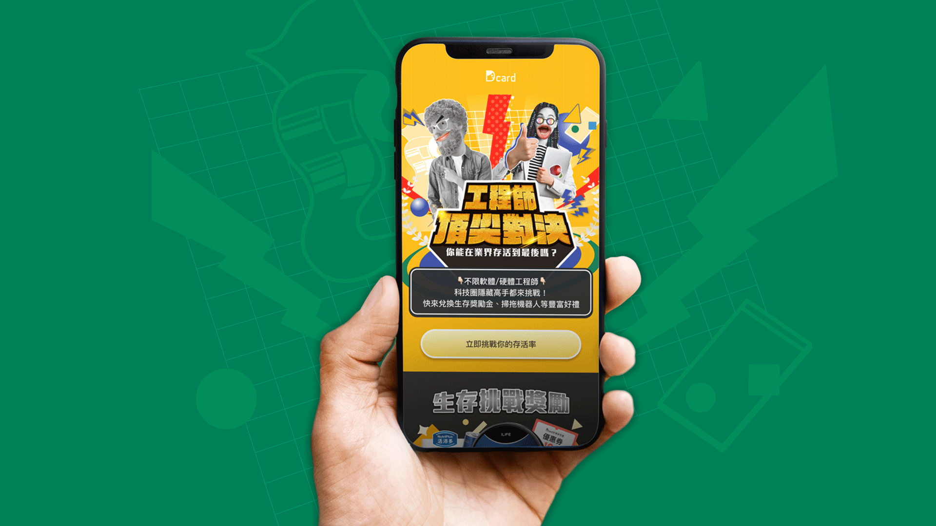
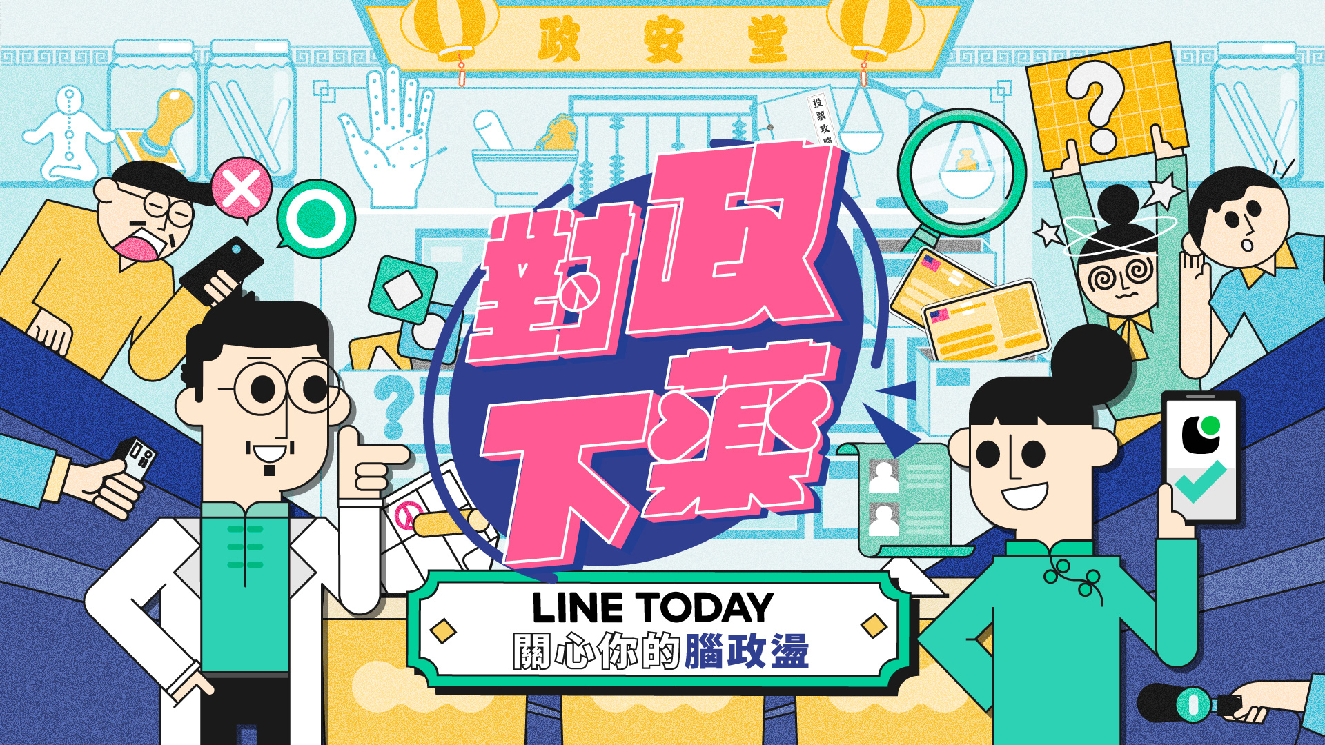
Dcard 營運團隊會透過有趣的活動企劃或跨品牌合作,提升用戶滲透率與擴散品牌宣傳。
在執行宣傳素材之前,我會先與小編或是社群經理一同檢視活動目的,討論宣傳文案,希望更了解整體活動內容,對焦需求者希望的視覺方向,即使是小張 banner,也力求設計能發揮最大的價值。
The Dcard operations team enhances user penetration and brand promotion through engaging event planning and cross-brand collaborations.
Before executing promotional materials, I collaborate with the content editors or community managers to review the objectives of the event and discuss the promotional copy. This helps me gain a better understanding of the overall event details and focus on the desired visual direction as per the needs of the target audience. Even for small elements like banners, I strive to design them to maximize their value.
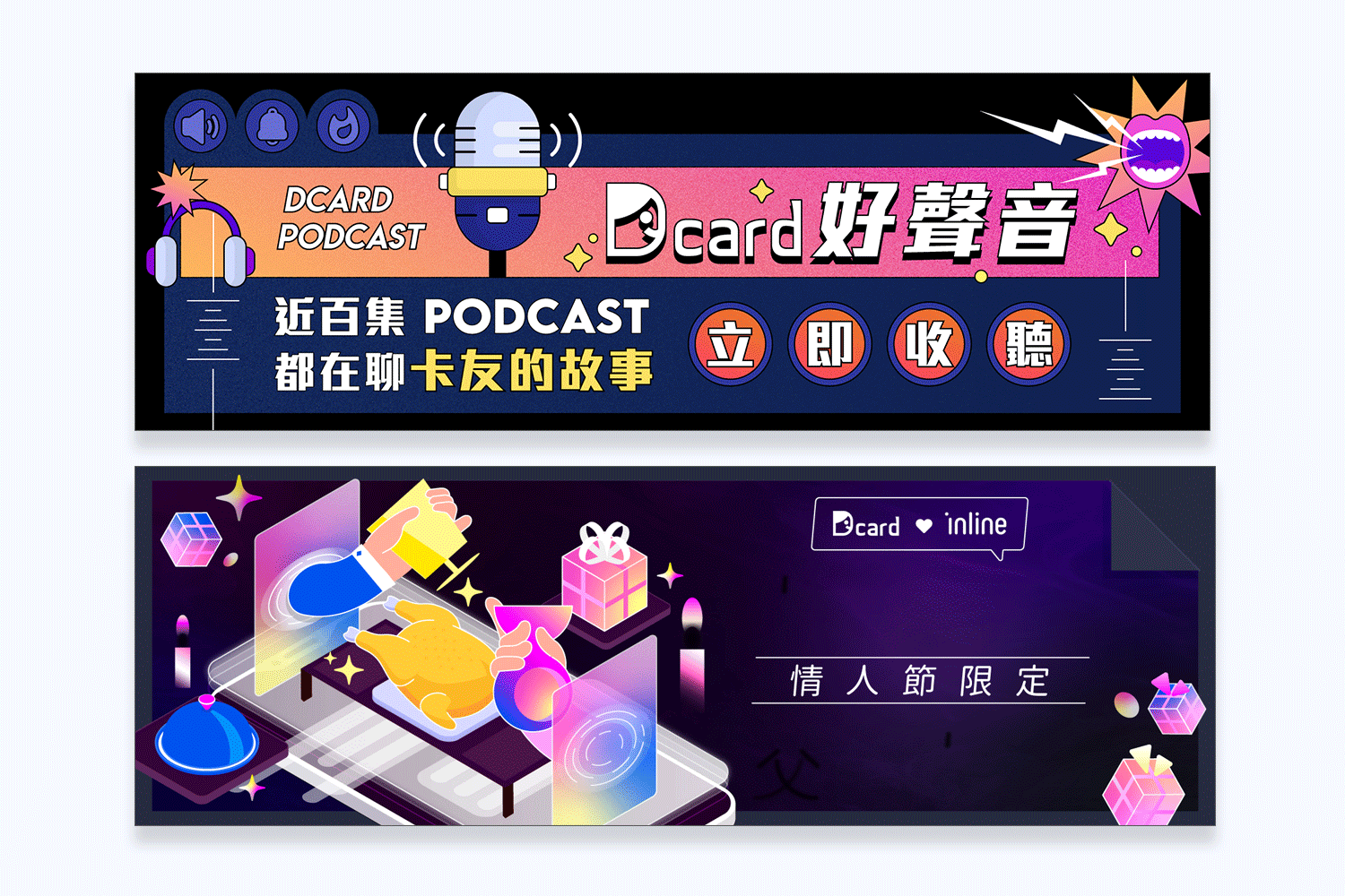
Dcard 與 Podcast、inline 跨品牌合作
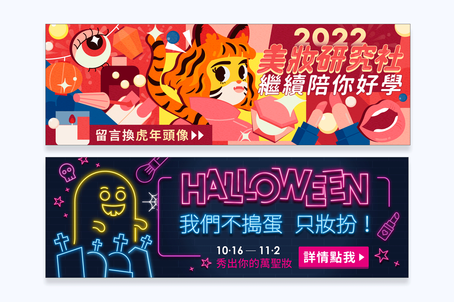
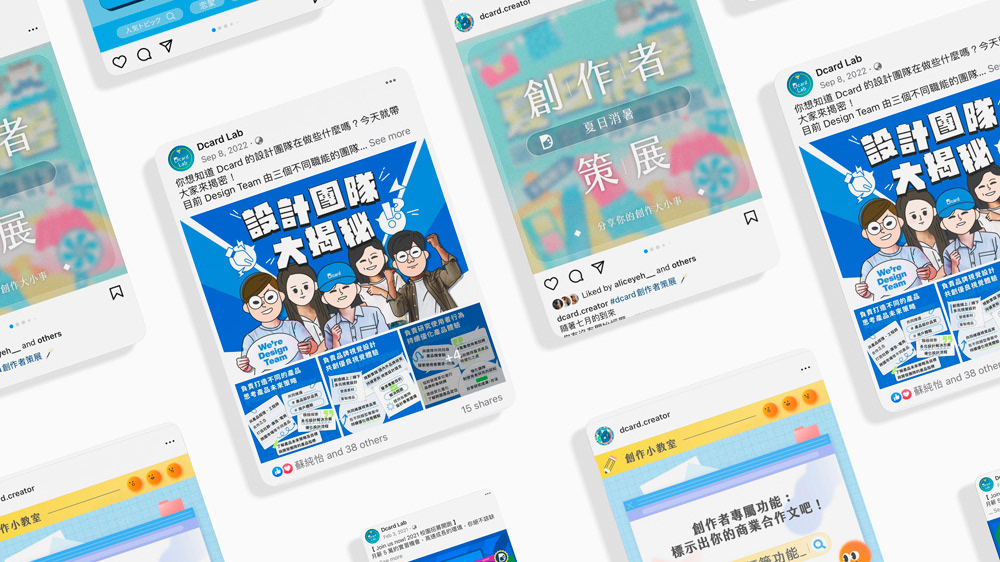
美妝板是 Dcard 熱門看板
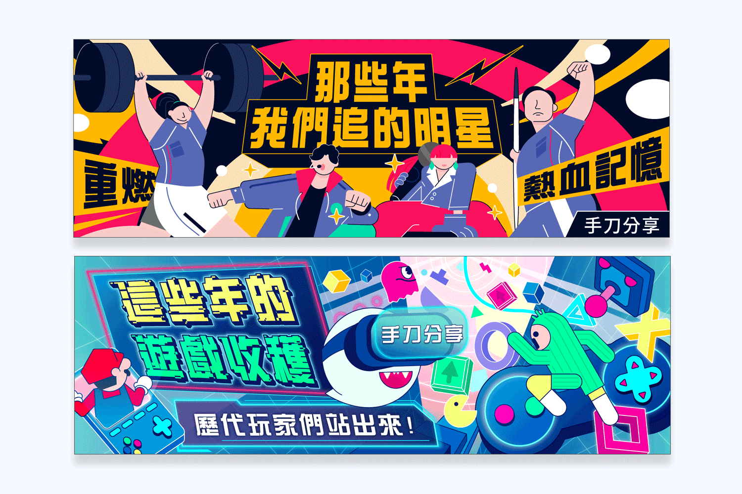
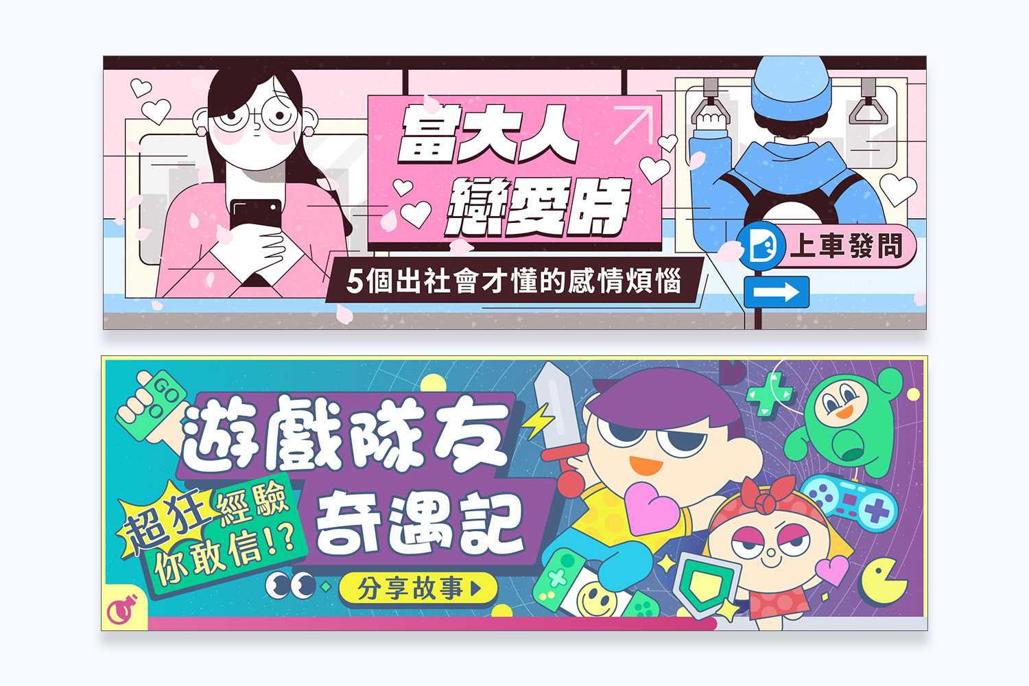
需持續推動不同主題活動刺激使用者的活躍度與留存率
需持續推動不同主題活動刺激使用者的活躍度與留存率
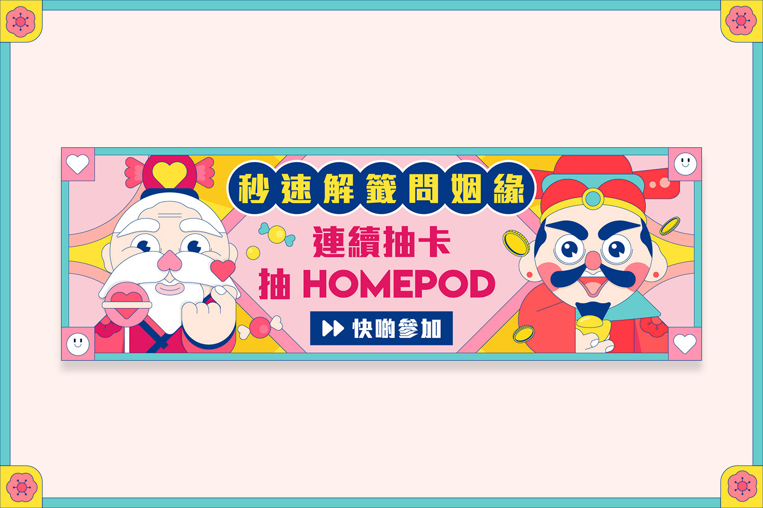
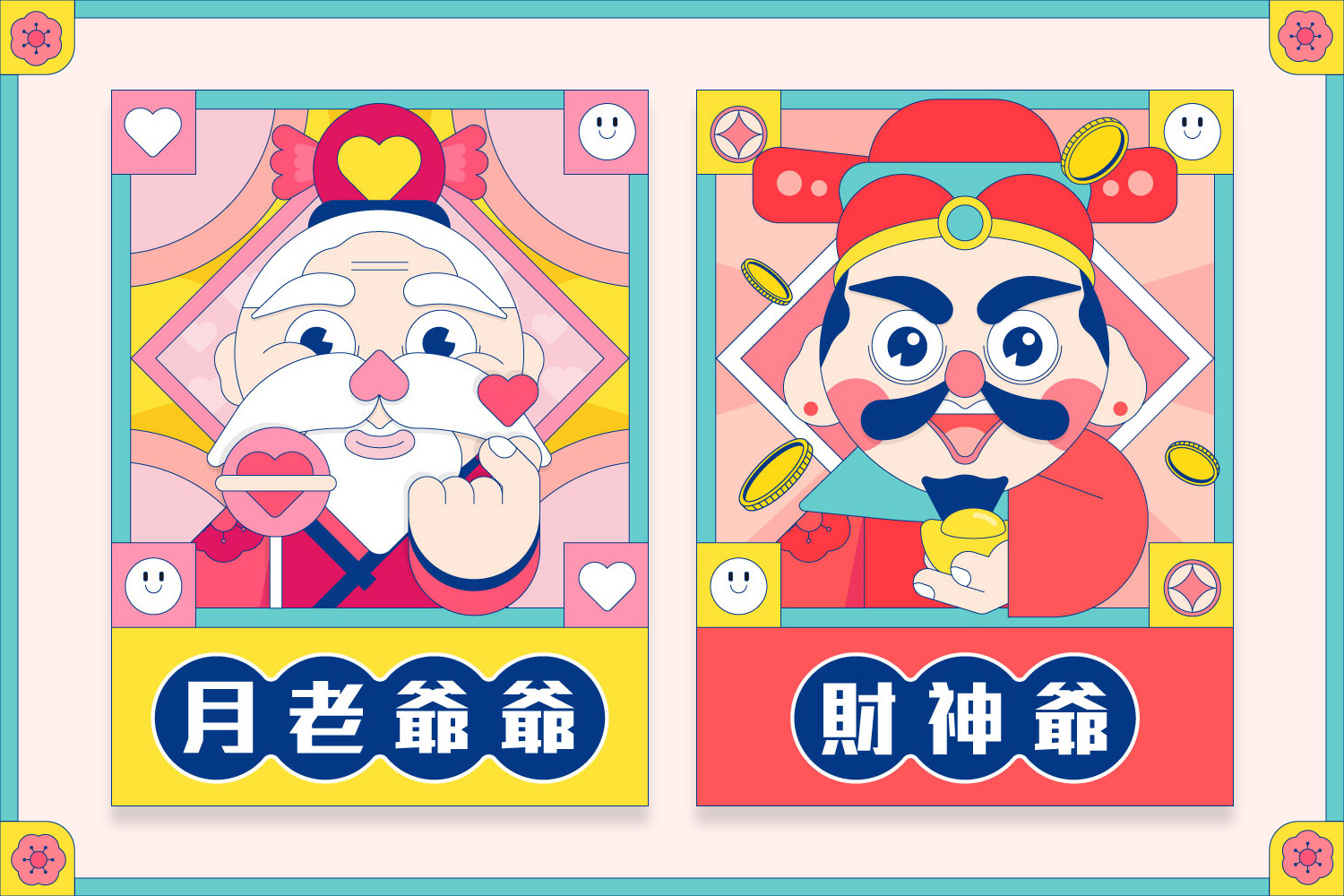
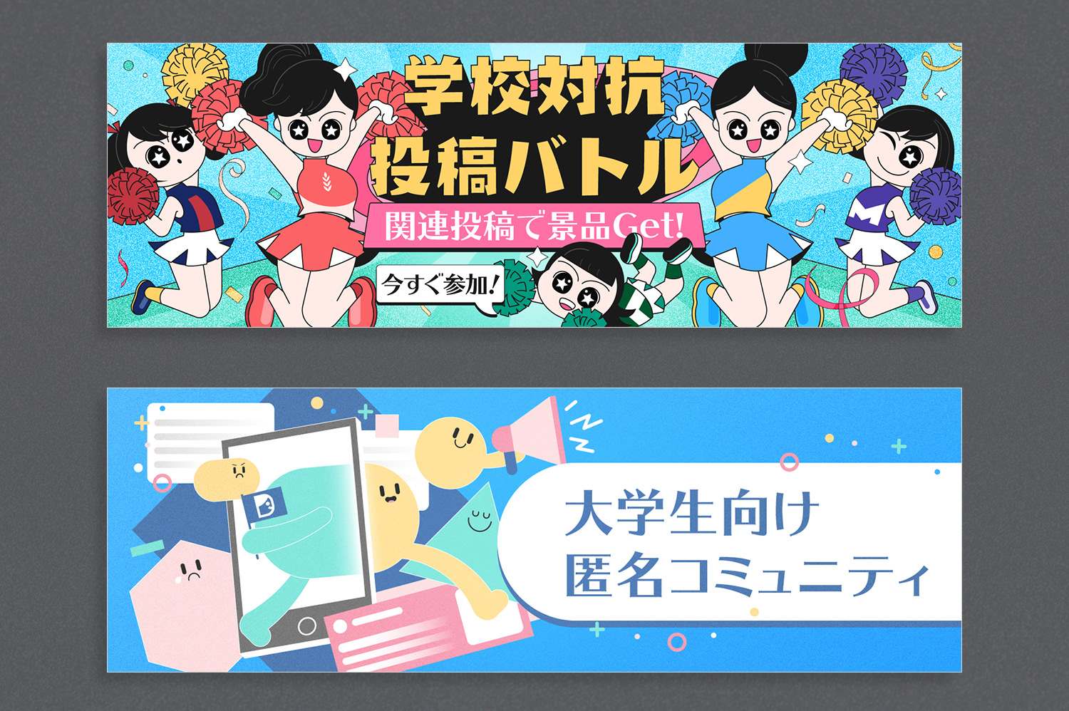
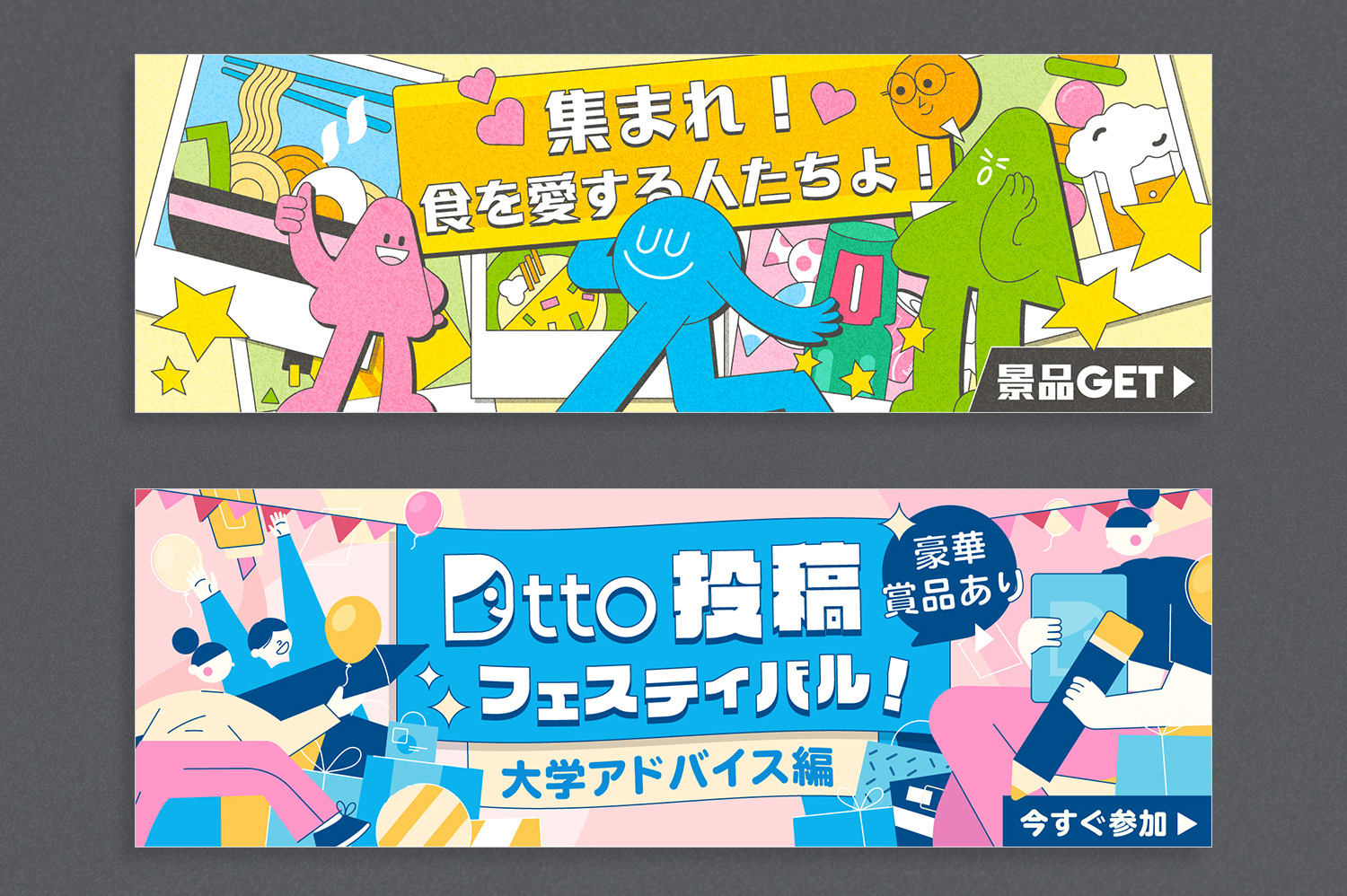
✨ Dtto ( Dcard 日本分部 ) 營運活動 素材設計系列 ✨
Dtto 是日本版的 Dcard,在與日本夥伴合作初期,對於日本年輕人喜歡的設計調性並不熟悉,在探索設計風格上遇到了不少困難,但也在過程中學習如何跨國合作與溝通協調。
台日兩邊對於視覺調性與配色喜好有些許不同,像是日本夥伴在設計的訴求上,偏好活潑的構圖,配上柔和色調。
在執行日本專案的過程中,我們希望能避免過於主觀的視覺喜好,除了大量的參考搜集資料並與企劃對焦外,也針對設計風格蒐集回饋擬定問卷,隨時檢視執行的設計方向有哪些是可以調整的。
The series of materials below were created to assist Dtto, the Japanese version of Dcard.
During the initial collaboration with our Japanese partners, we encountered some challenges in understanding the design preferences of Japanese youth. Exploring the design style proved to be difficult, but it also provided valuable lessons in cross-cultural collaboration and communication.
There are slight differences in visual style and color preferences between Taiwan and Japan. Our Japanese partners favor lively compositions with soft color tones in their designs.
During the execution of the Japanese project, we want to avoid overly subjective visual preferences. In addition to extensively collecting reference materials and aligning with the project plan, we also gather feedback and create questionnaires specifically for design styles. This allows us to constantly review and identify potential adjustments to the design direction.