#禮贈品設計 #Merchandise Design
2024 佳格健康GO KOL 聯名禮盒
2024 Healthy to GO Bundle Box
✨ 專案背景 Project Background
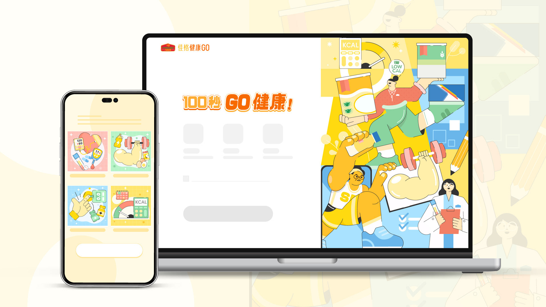
延伸佳格集團推出的「100 秒 GO 健康 」線上營養師服務,與不同的 KOL 聯名禮盒與推出宣傳影片,推動受眾前來響應「100 秒 GO 健康 」並體驗產品。
Expanding on the Standard Foods "100 Seconds GO Health" online nutritionist service, we collaborated with various KOLs to create co-branded gift boxes and promotional videos, encouraging audiences to engage with "100 Seconds GO Health" and experience the products.
✨ 設計概念 Design Concept
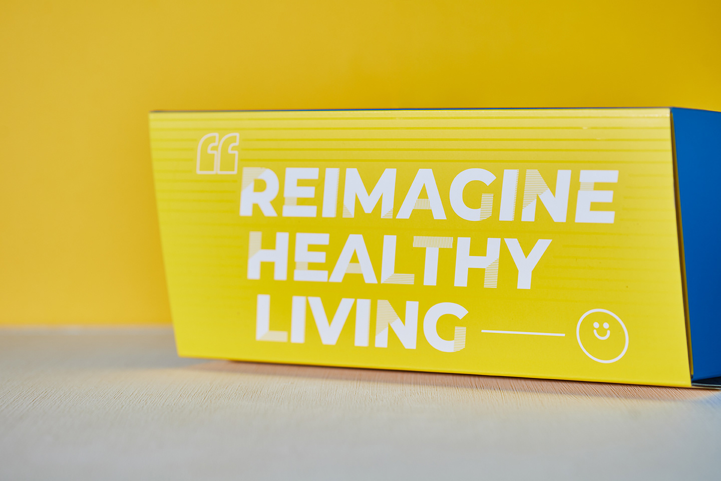
Reimagine Healthy Living ! 重組你的新生活想像!
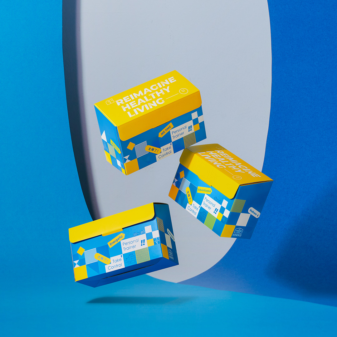
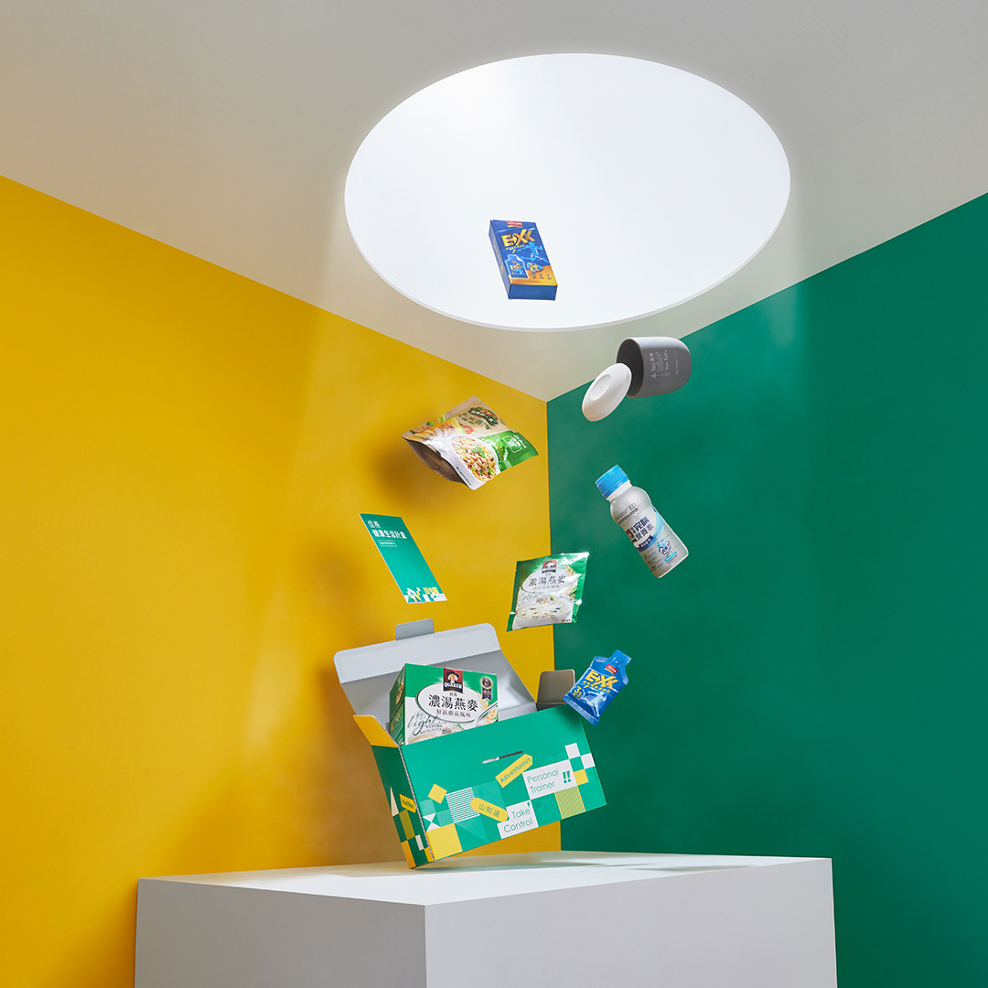
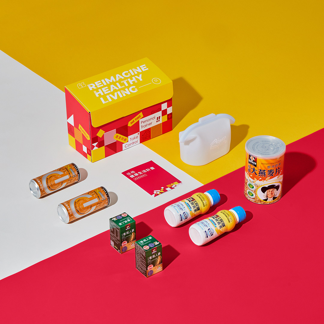
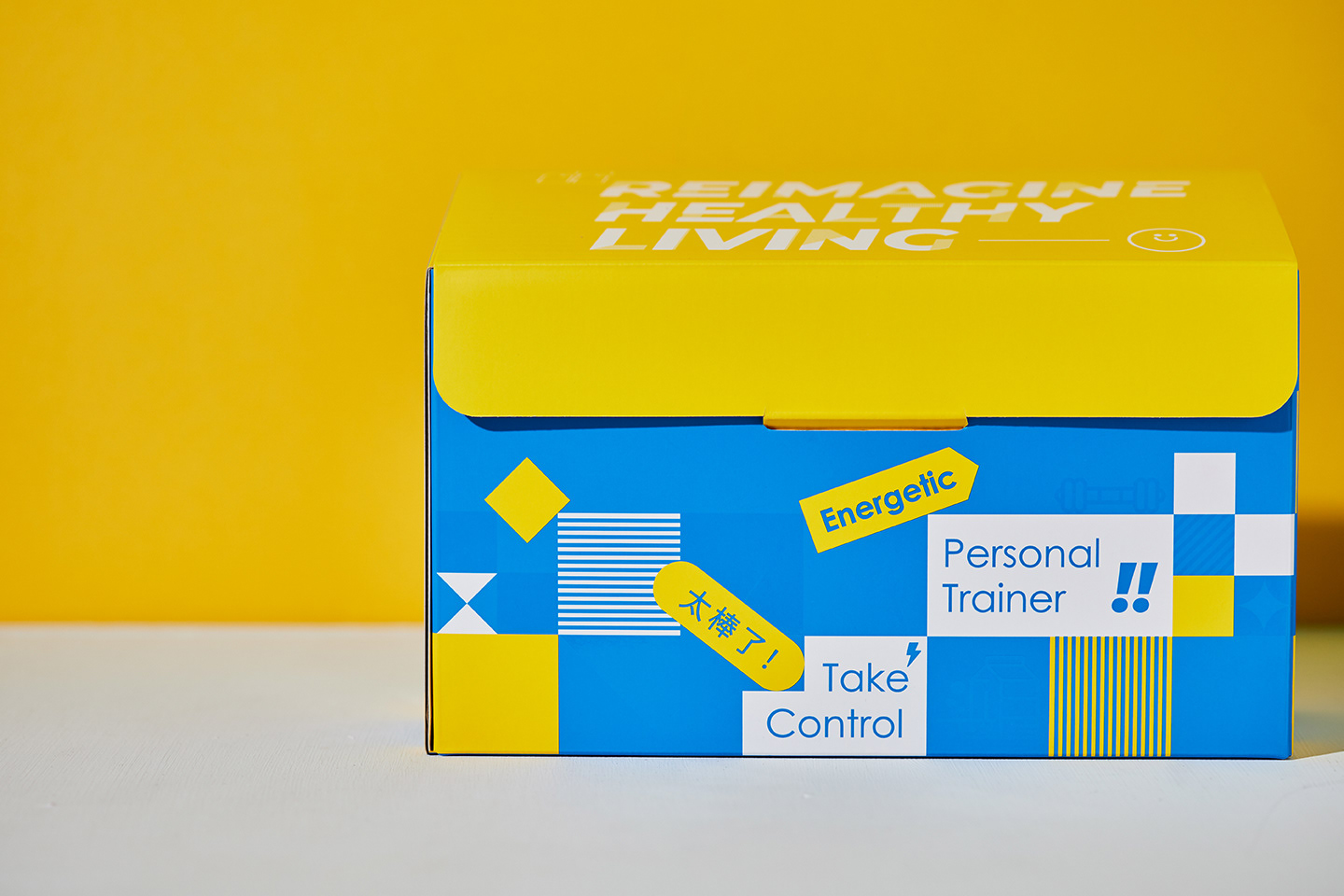
盒形使用「房子」的形狀,除了呼應集團 Logo 的房子形狀之外,也說明佳格產品服務也從個人涵蓋到整個家庭,而包裝上的視覺設計,則是利用方塊堆疊的意向,表達佳格產品陪伴每一個人重新建構新的健康生活,也想傳遞這個聯名活動的 Slogan - Reimagine Healthy Living 重組你的新生活想像!
盒形使用「房子」的形狀,除了呼應集團 Logo 的房子形狀之外,也說明佳格產品服務也從個人涵蓋到整個家庭,而包裝上的視覺設計,則是利用方塊堆疊的意向,表達佳格產品陪伴每一個人重新建構新的健康生活,也想傳遞這個聯名活動的 Slogan - Reimagine Healthy Living 重組你的新生活想像!
Reimagine Healthy Living!
The box is designed in the shape of a "house," which not only echoes the house shape of the group’s logo but also signifies that Quaker products and services extend from individuals to entire families.
The visual design on the packaging uses the concept of stacked blocks to symbolize how Quaker products accompany everyone in reconstructing a new healthy life. This also conveys the slogan of this collaboration - Reimagine Healthy Living!
✨ 顏色使用 Color Pallete
在顏色使用上,一開始主要有 2 個考量:
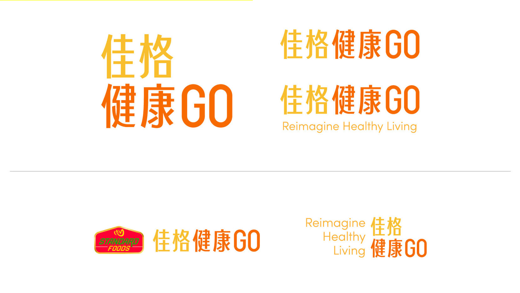
1. 延伸佳格集團 Logo 既有的品牌色 ( 黃、紅、綠 )
2. 為合作的 3 位 KOL 選出一個顏色作為視覺溝通的代表色
There were two main considerations:
Extending the existing brand colors of the Standard Foods logo (yellow, red, green)
Selecting a color for each of the three KOLs to serve as a representative color for visual communication.
1. 延伸佳格集團 Logo 既有的品牌色 ( 黃、紅、綠 )
2. 為合作的 3 位 KOL 選出一個顏色作為視覺溝通的代表色
There were two main considerations:
Extending the existing brand colors of the Standard Foods logo (yellow, red, green)
Selecting a color for each of the three KOLs to serve as a representative color for visual communication.
🟡 黃色 Yellow ( 主色 ):
我認為黃色本身代表著活力、能量、快樂,這次與 KOL 合作的系列宣傳,也希望整體是能給人充滿能量感的,因此我將黃色作為主色
Yellow represents vitality, energy, and happiness. Since this series of promotions with the KOLs aims to convey a sense of energy, I chose yellow as the main color.
我認為黃色本身代表著活力、能量、快樂,這次與 KOL 合作的系列宣傳,也希望整體是能給人充滿能量感的,因此我將黃色作為主色
Yellow represents vitality, energy, and happiness. Since this series of promotions with the KOLs aims to convey a sense of energy, I chose yellow as the main color.
🔵 藍色 Blue ( 代表家凱 ):
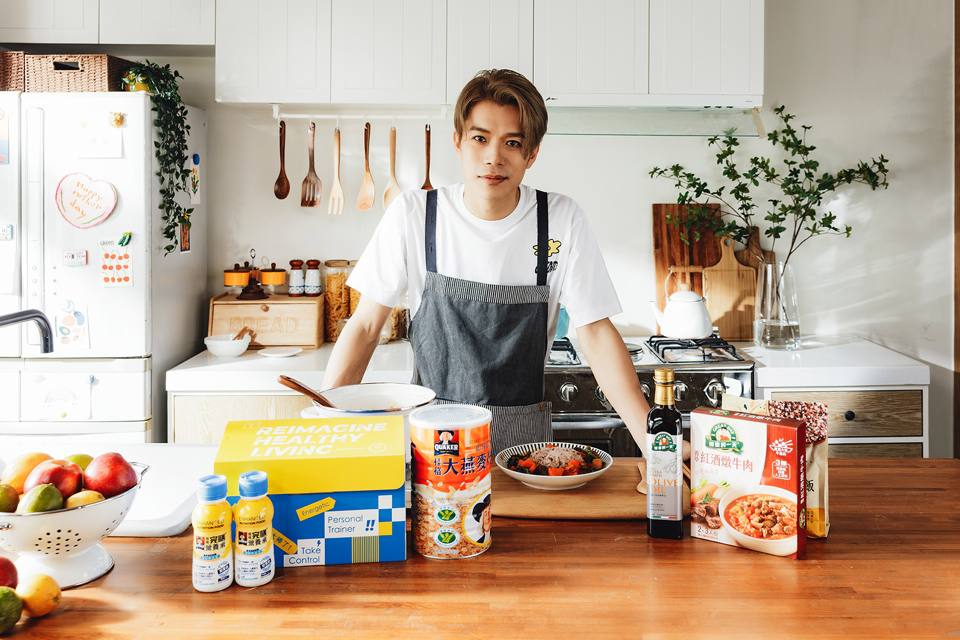
家凱總是給人一種安靜、沈穩氛圍,在訪談時他也提到自己喜歡游泳,而藍色本身就給人比較沈穩冷靜的感受,藍色也能聯想到水、游泳,因此挑選了藍色應用在與家凱聯名的盒子上。
K6 always gives off a quiet and calm vibe. During the interview, he mentioned his love for swimming. Blue naturally evokes feelings of calm and stability and can also be associated with water and swimming. Therefore, blue was selected for the box in collaboration with K6.
🟢 綠色 Green( 代表阿泰呆呆 ):
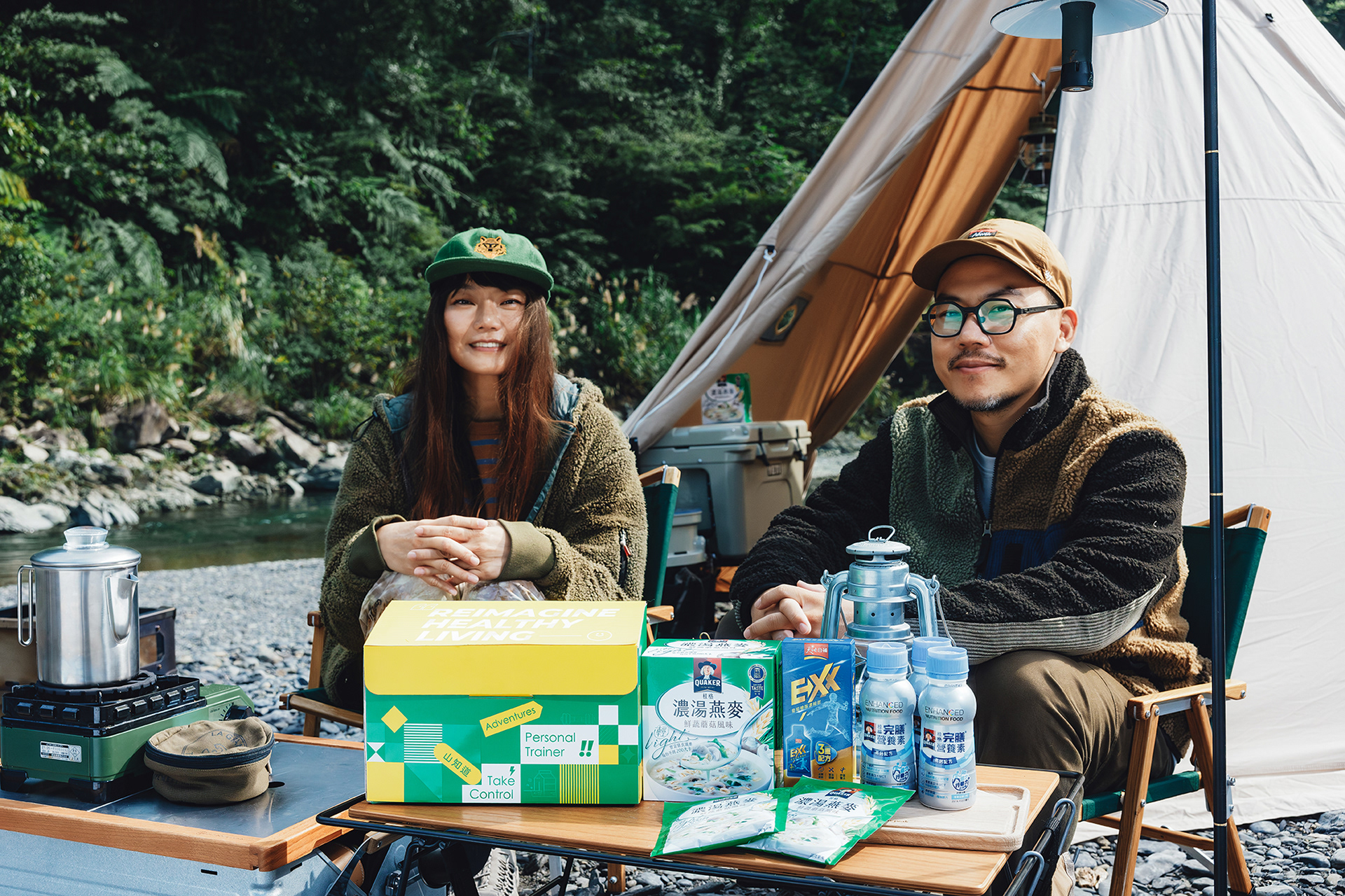
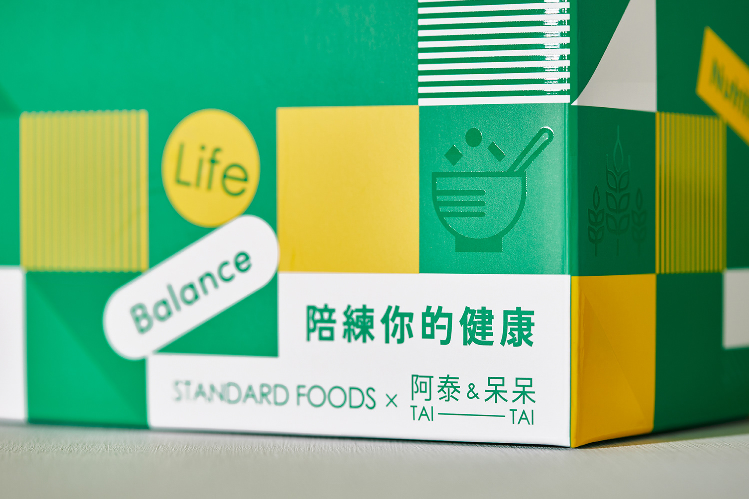
阿泰呆呆是露營登山好手,也在頻道分享需多跟山野、綠營相關的主題,與大自然高度連結的他們,我認為選擇綠色作為代表色非常適合!
Tai Tai is an expert in camping and hiking and often shares topics related to mountains and greenery on their channel. Given their strong connection with nature, I thought green was a perfect representative color for them.
阿泰呆呆是露營登山好手,也在頻道分享需多跟山野、綠營相關的主題,與大自然高度連結的他們,我認為選擇綠色作為代表色非常適合!
Tai Tai is an expert in camping and hiking and often shares topics related to mountains and greenery on their channel. Given their strong connection with nature, I thought green was a perfect representative color for them.
🔴 紅色 Red( 代表歐陽靖 ):
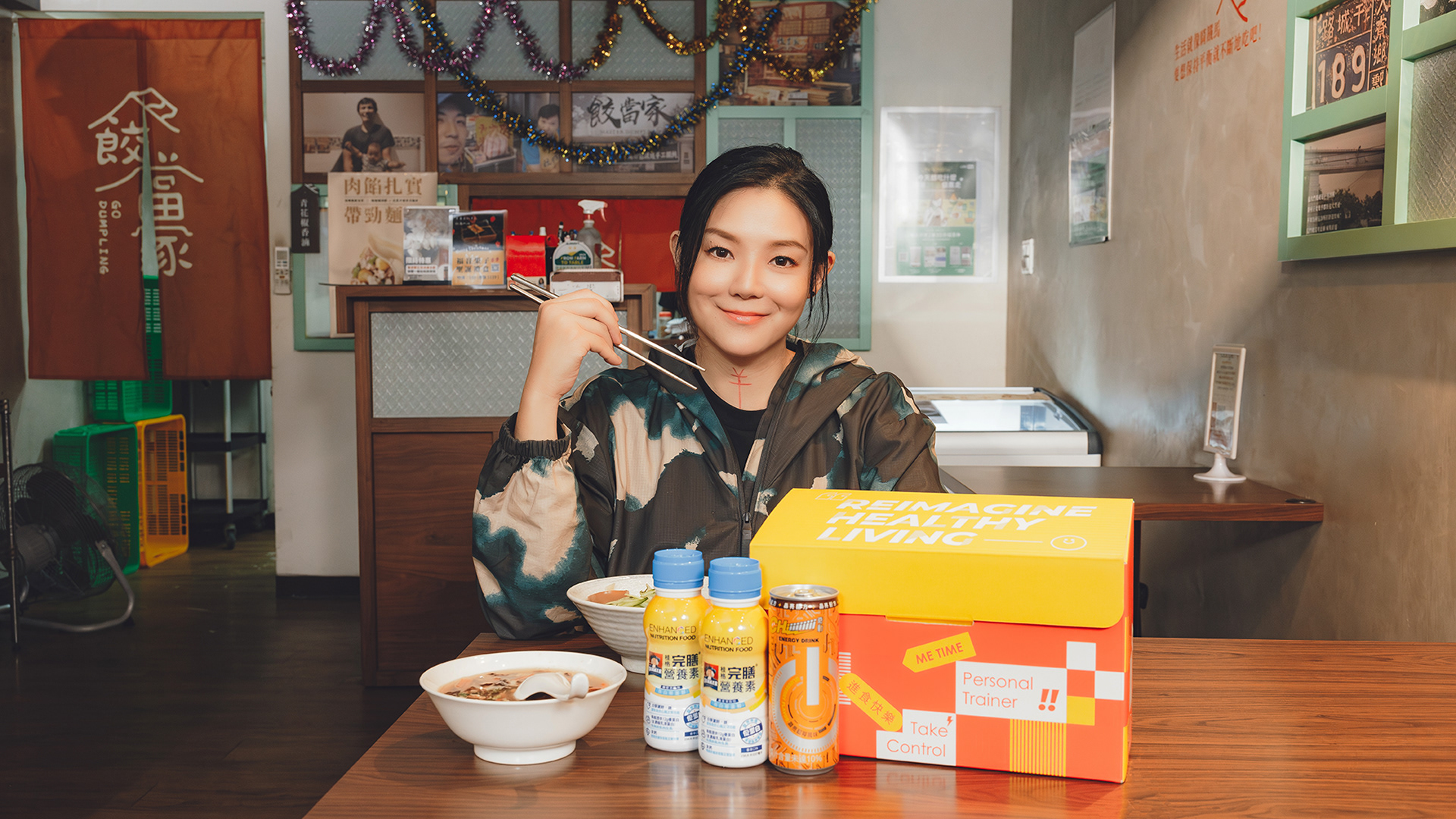
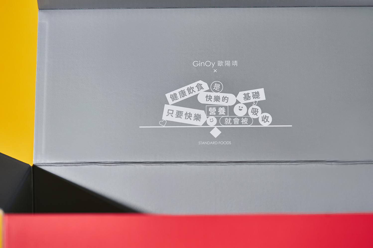
大家對歐陽靖的的跑者身份可能最有印象,不過現在她也成為了一位媽媽,在社群中不難看到她流露出滿滿的母愛,我認爲他過去對馬拉松的熱情,與現在照護孩子的愛,都非常適合使用有著熱情、自信、愛的紅色作為歐陽靖的代表色。
GinOy is well known as a runner, but she has also become a mother. Her social media frequently shows her expressing deep maternal love. I believe her passion for marathons and her current role as a caring mother are well represented by red, a color symbolizing passion, confidence, and love.
